
고래씌
[CSS] 4-3. FlexBox ③ (item 전용 속성-수축, 팽창 등) 본문
1. item 전용 속성
1) order : item의 순서를 지정하는 속성
▶ order
: flex-container 내부 item의 순서를 지정하는 속성
(기본값 0, 정수, 양수/음수 사용 가능)
■ flexbox3.html
<!DOCTYPE html>
<html lang="ko">
<head>
    <meta charset="UTF-8">
    <meta name="viewport" content="width=device-width, initial-scale=1.0">
    <title>FlexBox3</title>
    <link href="../css/flex-style3.css" rel="stylesheet">
    <link href="../css/style.css" rel="stylesheet">
</head>
<body>
    <h1>item 전용 속성</h1>

    <h3>order : item의 순서를 지정하는 속성</h3>
    <div class="flex-container">
        <!-- .item.item$.order{item$}*5 -->
        <div class="item item1 order1">item1</div>
        <div class="item item2 order2">item2</div>
        <div class="item item3 order4">item4</div>
        <div class="item item4 order5">item5</div>
        <div class="item item5 order3">item3</div>
    </div>

</body>
</html>
■ style.css(모두 import되어있다)
■ flex-style3.css
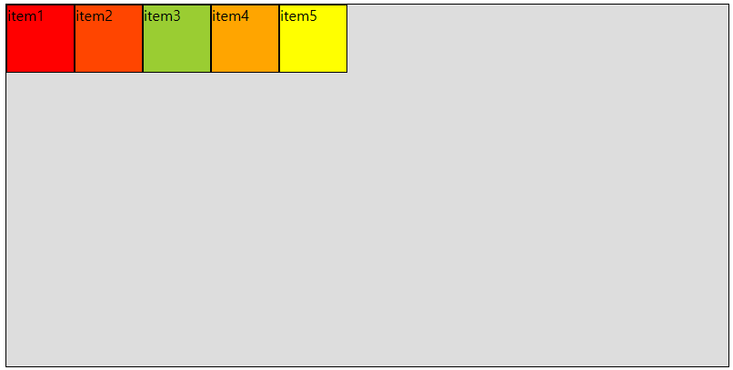
☞ 우리는 앞서 item의 순서를 섞어서 지정을 하였었다. 하지만, order 속성을 준 결과, 결과화면은 item1, item2, item3, item4, item5로 순서대로 출력되는 것을 확인할 수 있다.

2) flex-grow(팽창)
: item이 flex-container내부에서 비어있는 공간을 메꿀 수 있도록 팽창하는 정도를 지정하는 속성
→ 지정된 비율에 맞게 팽창함(기본값 0 => 팽창 x)
■ flexbox3.html(style.css 파일 이용)
■ flex-style3.css
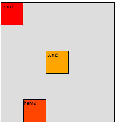
☞ grow1을 추가하면 item 나머지가 0이면 item1이 다 차지함.
☞ grow2까지 추가해주면 1과 2가 서로 경쟁을 함
☞ 결국 flex-grow : 4가 가장 많은 비율을 차지하게 됨

3) flex-shrink
: item이 수축하는 정도를 지정하는 속성(기본값 1)
■ flexbox3.html(style.css 파일 이용)

■ flex-style3.css

☞ flex-shrink: 0 => 수축을 아예 안하고
flex-shrink: 4 => (화면을 축소했을 때)수축이 가장 많이 일어나는 것을 볼 수 있음
4) flex-basis
: item의 main axis 방향으로의 기본 점유율을 지정하는 속성
(각종 크기단위를 사용할 수가 있다(px, %, vh, em, rem))
■ flexbox3.html(style.css 파일 이용)

■ flex-style3.css

5) align-self
: 각각의 item별로 cross axis 방향으로 정렬을 지정하는 속성
■ flexbox3.html(style.css 파일 이용)

■ flex-style3.css
☞ flex: 0 0 100px; => flex-grow, flex-shrink, flex-basis 3개를 합쳐서 사용할 수 있다
'Front-End > CSS' 카테고리의 다른 글
| [CSS] 6. 글꼴(폰트)관련 스타일 (1) | 2023.11.03 |
|---|---|
| [CSS] 5. 글자관련 스타일 (1) | 2023.11.03 |
| [CSS] 4-2. FlexBox ② (flex-container 전용 속성) (1) | 2023.11.03 |
| [CSS] 4-1. Flex Box ① (0) | 2023.11.03 |
| [CSS] 3-4. 레이아웃(Layout) 스타일 ④ (배치 관련) (0) | 2023.11.03 |


