고래씌
[CSS] 8. 웹문서 구조(실습) 본문
☞ 이런 웹페이지를 만들려고 한다. 만들어 보거라.
☞ HTML 파일에 각각 따로 만들어 둔 뒤, 하나의 파일(html, css)로 합칠 예정

1. 검색창
■ 15_검색창.html 의 body태그
<body>
    <div class="header">
        <!-- header의 첫번째 자식 사이트 로고-->
        <div></div>
        <!-- header의 두번째자식div(검색창)-->
        <div class="search-area">
            <form action="#" name="search-form">
                <!--form내부 input들을 그룹화시킬때 사용-->
                <fieldset>
                    <input type="search" name="query" id="query"
                    placeholder="검색어를 입력해주세요"
                    autocomplete="off">
                    <!--autocompleto : html 의 기본자동완성 사용여부-->
                    <button type="submit" id="search-btn"
                    class="fa-solid fa-magnifying-glass"></button>
                </fieldset>
            </form>
        </div>
        <div></div>
    </div>
</body>
■ 15_검색창.html 의 style 태그
    <style>
        /* header*/
        *{box-sizing:border-box;}
        div{
            border:1px solid black;
        }
        .header{
            height:200px;
            display: flex;
        }
        /* flex-basis : 중심축 기준 각 아이템의 점유율 설정할수 있었다.*/
        .header > div:nth-of-type(1){
            flex-basis : 15%;
        }
        .header > div:nth-of-type(2){
            flex-basis : 70%;
        }
        .header > div:nth-of-type(3){
            flex-basis : 15%;
        }
        .search-area{
            width: 500px;
        }
        .search-area fieldset{
            padding : 2px;
            margin:0;
            border : 2px solid blue;
            border-radius : 10px;
            display: flex;
        }
        #query{
            padding: 10px;
            font-size: 18px;
            font-weight: bold;
            border : none;
            /*
                outline : input태그에 포커스가 맞춰졌을때
                이를 표현하기 위한 바깥쪽 선(테두리보다 바깥에 존재)
            */
            outline : none;
            width:92%;
        }
        #search-btn{
            width:8%;
            cursor:pointer;
            font-size:1.2em;
            color: #455BA8;;
            background-color: white;
            border: 0;
        }
    </style>
    <script src="https://kit.fontawesome.com/a2e8ca0ae3.js" crossorigin="anonymous"></script>
▶ ① *{box-sizing: border-box;}
=> 박스의 크기를 테두리 기준으로 크기를 정한다.
- content-box : 콘텐트 영역을 기준으로 크기를 정한다.
- border-box : 테두리를 기준으로 크기를 정한다.
- initial : 기본값으로 설정한다.
- inherit : 부모 요소의 속성값을 상속받는다.
▶ ② .header > div:nth-of-type(1) { flex-basis : 15%;}
.header > div:nth-of-type(2) { flex-basis : 70%;}
.header > div:nth-of-type(3) { flex-basis : 15%;}
☞ flex - basis : 중심축 기준 각 아이템의 점유율 설정할 수 있었다.
=> header 클래스의 div태그의 첫번째 자손은 15%, 두번째 자손은 70% 세번째 자손은 15%의 면적을 차지함

▶ ③ #query { ~
outline : none; => input태그에 포커스가 맞춰졌을 때 이를 표현하기 위한 바깥쪽 선(테두리보다 바깥에 존재)


▶ ④ search-btn{ ~
cursor : porinter => 마우스 커서 모양을 손가락 모양으로 변경

돋보기는 https://fontawesome.com/search?q=search&o=r 이 사이트에서 가져올 수 있다.
Font Awesome
The internet's icon library + toolkit. Used by millions of designers, devs, & content creators. Open-source. Always free. Always awesome.
fontawesome.com
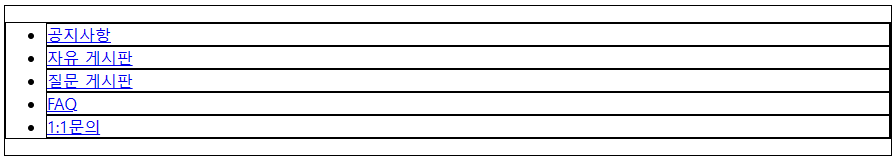
2. navigator
■ 16_navigator.html 의 body 태그
<body>
    <div class="nav">
        <!-- ul>(li>a)*5 -->
        <ul>
            <li><a href="#">공지사항</a></li>
            <li><a href="#">자유 게시판</a></li>
            <li><a href="#">질문 게시판</a></li>
            <li><a href="#">FAQ</a></li>
            <li><a href="#">1:1문의</a></li>
        </ul>
    </div>

</body>
■ 16_navigtor.html 의 style태그
    <style>
        *{box-sizing: border-box;}
        div, ul, li {border: 1px solid black}

        .nav{
            width: 1140px;
            height: 50px;
        }

        /* 한줄로 설정 */
        .nav > ul {
            display: flex;
            list-style: none;
            padding: 0;
            margin: 0;
            height: 100%;
        }

        .nav li{
            flex : 0 1 150px;
            /* 팽창, 수축, 기본값 */
        }

        .nav a {
            display: block;
            height: 100%;

            /* 글자를 가로로 가운데 정렬 */
            text-align: center;

            /* 글자를 세로로 가운데 정렬 */
            /* 세로 가운데 정렬 1번째 방법 */
            /* line-height: 48px; border 값을 제거해주어야 하기 때문에 48px 부여 */


            /* 세로 가운데 정렬 2번째 방법 */
            padding: 11px 0;

            text-decoration: none; /* 밑줄제거 */
            color: black;
            font-size: 18px;
            font-weight: bold;
            border-radius: 5px;
            transition: 0.1s;
        }

        .nav a:hover{
            background-color: #455ba8;
            color:white;
        }

    </style>
▶ ~ .nav{width: 1140px; height: 50px;} 까지
▶ .nav > ul {}
display: flex;
=> 한줄로 설정
list-style: none;
=> 옆에 ● 삭제
padding: 0;
margin: 0;
height: 100%;

▶ .nav li {}
flex : 0 1 150px;
=> 팽창, 수축, 기본값

▶ .nav a{}
display : block;
=> 안에 글자를 가운데 정렬을 하기 위해서 먼저 선언을 해준다.
text-align: center;
=> 글자가 가로로 가운데 정렬됨
padding: 11px 0; => 세로 가운데 정렬
text-decoration : none; => 밑줄 제거
...
border-radius : 5px;
transition: 0.1s; ==> hover를 했을 때 변화를 주기위해 지정함

▶ .nav a: hover{}
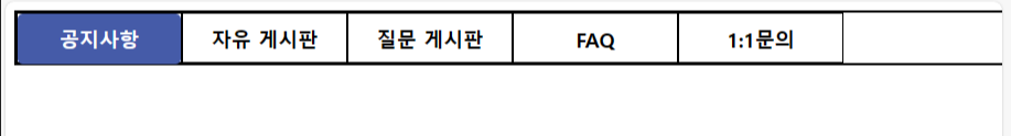
☞ 마우스를 갖다댔을 때 이와 같이 변함
3. login
■ 17_login.html 의 body 태그
<body>
    <div class="content">
        <div class="content-1"></div>
        <div class="content-2">
            <form action="#" name="login-form" mehtod="post">

                <!-- 아이디/비번/로그인버튼 영역 -->
                <fieldset id="id-pw-area">

                    <!-- 아이디/ 비번 -->
                    <div>
                        <input type="text" name="inputId" placeholder="아이디">
                        <input type="password" name="inputPw" placeholder="비밀번호">
                    </div>

                    <!-- 버튼 -->
                    <div>
                        <button>로그인</button>
                    </div>

                </fieldset>

                <!-- 회원가입 / 아이디, 비번찾기 영역 -->
                <div ID="signup-find-area">
                    <a href="#">회원가입</a>
                    <span>|</span>
                    <a href="#">ID/PW 찾기</a>
                </div>
            </form>
        </div>
    </div>
</body>
■ 17_login.html 의 style태그
    <style>
        *{
            box-sizing: border-box;
            /* border: 1px solid black; */
        }

        div{
            /* border: 1px solid black; */
        }

        .content{
            width: 1000px;
            height: 800px;
            display: flex;
        }

        .content-1{flex-basis: 70%;}
        .content-2{flex-basis: 30%;}

        #id-pw-area{
            border: 1px solid #ddd;
            margin: 0px;
            padding: 0px;
            display: flex;
        }

        #id-pw-area > div:first-of-type{
            flex-basis: 75%;

            /* 정렬방향을 한줄로 */
            display: flex;

            /* 정렬방향을 아래로 향하게 함 */
            flex-direction: column;
        }

        #id-pw-area input{
            flex-basis: 50%;
            border: 0;
            border-right: 1px solid #ddd;
            outline: 0;
            margin: 0;
            padding: 5px;
        }

        #id-pw-area input:first-child{
            border-bottom: 1px solid #ddd;
        }

        #id-pw-area > div:last-of-type{
            flex-basis: 25%;
            display: flex;

            /* 다른 요소와 충돌이 있을것을 방지 */
            justify-content: center;
        }

        #id-pw-area input:focus{
            border: 2px solid #455ba8
        }

        /* 로그인 버튼 */
        #id-pw-area button{
            width: 100%;
            border:0;
            background-color: white;
            cursor: pointer;
        }

        #id-pw-area button:hover{
            background-color: #455ba8;
            color: white;
        }


        /* 회원가입 / ID/PW찾기 영역 */
        #signup-find-area{
            margin-top:10px;
            padding-left: 5px;
        }

        #signup-find-area a{
            color:black;
            text-decoration: none;
            font-size:14px;
        }

        #singup-find-area > span{
            padding:0 10px;
        }
    </style>
1) 아이디, 비밀번호
▶ .content{}
display: flex;

▶ .content-1{flex-basis: 70%}
.content-2{flex-basis: 30%}

☞ item들을 크기 지정한다
flex 관련 지식이 궁금하다면 아래 링크 참고
https://studiomeal.com/archives/197
이번에야말로 CSS Flex를 익혀보자
이 튜토리얼은 “차세대 CSS 레이아웃” 시리즈의 첫번째 포스트입니다. 이번에야말로 CSS Flex를 익혀보자 이번에야말로 CSS Grid를 익혀보자 벌써부터 스크롤의 압박이 느껴지고,‘좀 편안하게 누
studiomeal.com
▶#id-pw-area{}
...
display : flex; => 로그인 버튼을 오른쪽으로 정렬됨

▶ id-pw-area > div:first-of-type{}
flex-basis: 75%
☞ 로그인이 가로로 정렬되도록 가로 넓이를 넓혀줌
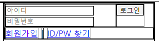
display: flex;
아이디, 비밀번호 입력창의 정렬방향을 한줄로

flex-direction: column;
☞ 아이디 비밀번호 입력창의 정렬 방향을 아래로 향하게 함

▶ id-pw-area input{}
...
border=0;
border-right: 1px solid #ddd;
☞ 아이디, 비밀번호 text상자 의 테두리를 없애고 1px의 얇은 실선 적용시킨다.
...

▶ id-pw-area > div:last-of-type{
flex-basis : 25%;
display: flex;
justify-content: center;
☞ 다른 요소와 충돌이 있을 것을 방지

▶ #id-pw-area input:focus{
border: 2px solid #455ba8
}
☞ 클릭하였을 때 이와 같은 테두리 색이 변경되도록 적용

2) 로그인 버튼

☞ 마우스를 갖다댔을 때 색깔이 변화도록 hover 지정
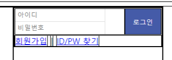
3) 회원가입 / ID/PW 찾기 영역


4. footer
■ 18_footer.html의 body태그
<body>
    <div class="footer">
        <p>Copyright @copy; Whale Information Educational Institute class</p>

        <div>
            <a href="#">프로젝트 소개</a>
            <span>|</span>
            <a href="#">이용약관</a>
            <span>|</span>
            <a href="#">개인정보처리방침</a>
            <span>|</span>
            <a href="#">고객센터</a>

        </div>
    </div>

</body>
■ 18_footer.html의 style태그
    <style>
        *{box-sizing: border-box;}
        div{border: 1px solid black;}

        .footer{
            height: 200px;
            background-color: #a3add342;
            display: flex;
            flex-direction: column;
            justify-content: center;
            align-items: center;
        }

        .footer > p{
            font-weight: bold;
        }

        .footer > div > *{
            font-size: 14px;
        }

        .footer a{
            text-decoration: none;
            color: black;
        }

        .footer span{
            padding: 0 10px;
        }
    </style>
▶ .footer{
...
display: flex;
flex-direction: column;
justify-content: center;
align-items: center;
☞ 가운데 정렬을 해주기 위해 적용함
위 모두 적용 시키면 이와 같은 화면이 적용됨

5. 웹 문서 구조(검색창 + 사진 + navigator + login + footer)
■ 14_웹문서구조.html
<!DOCTYPE html>
<html lang="en">
<head>
<meta charset="UTF-8">
<meta name="viewport" content="width=device-width, initial-scale=1.0">
<title>14_웹문서구조</title>
<link rel="stylesheet" href="resources/css/structure.css">
<script src="https://kit.fontawesome.com/a2e8ca0ae3.js" crossorigin="anonymous"></script>
</head>
<body>
<div class="container">
<div class="header">
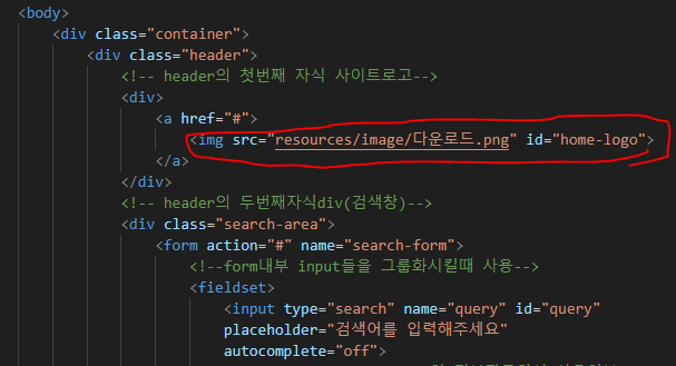
<!-- header의 첫번째 자식 사이트로고-->
<div>
<a href="#">
<img src="resources/image/다운로드.png" id="home-logo">
</a>
</div>
<!-- header의 두번째자식div(검색창)-->
<div class="search-area">
<form action="#" name="search-form">
<!--form내부 input들을 그룹화시킬때 사용-->
<fieldset>
<input type="search" name="query" id="query"
placeholder="검색어를 입력해주세요"
autocomplete="off">
<!--autocompleto : html 의 기본자동완성 사용여부-->
<button type="submit" id="search-btn"
class="fa-solid fa-magnifying-glass"></button>
</fieldset>
</form>
</div>
<div></div>
</div>
<div class="nav">
<!-- ul>(li>a)*5 -->
<ul>
<li><a href="#">공지사항</a></li>
<li><a href="#">자유 게시판</a></li>
<li><a href="#">질문 게시판</a></li>
<li><a href="#">FAQ</a></li>
<li><a href="#">1:1문의</a></li>
</ul>
</div>
<div class="content">
<div class="content-1"></div>
<div class="content-2">
<form action="#" name="login-form" mehtod="post">
<!-- 아이디/비번/로그인버튼 영역 -->
<fieldset id="id-pw-area">
<!-- 아이디/ 비번 -->
<div>
<input type="text" name="inputId" placeholder="아이디">
<input type="password" name="inputPw" placeholder="비밀번호">
</div>
<!-- 버튼 -->
<div>
<button>로그인</button>
</div>
</fieldset>
<!-- 회원가입 / 아이디, 비번찾기 영역 -->
<div ID="signup-find-area">
<a href="#">회원가입</a>
<span>|</span>
<a href="#">ID/PW 찾기</a>
</div>
</form>
</div>
</div>
<div class="footer">
<p>Copyright @copy; Whale Information Educational Institute class</p>
<div>
<a href="#">프로젝트 소개</a>
<span>|</span>
<a href="#">이용약관</a>
<span>|</span>
<a href="#">개인정보처리방침</a>
<span>|</span>
<a href="#">고객센터</a>
</div>
</div>
</body>
</html>
■ structure.css
*{box-sizing: border-box;}

body{margin: 0;} /* body태그의 기본 margin 제거 */


.container{
    width: 1140px;
    margin:auto;

}


/* 추가 된 것  (color: black; 삭제, text-decoration:none; 삭제 */
a{
    text-decoration: none;
    color: black;
}


/* ------ */


/* 검색창 */
/* header*/

.header{
    height:200px;
    display: flex;

}
/* flex-basis : 중심축 기준 각 아이템의 점유율 설정할수 있었다.*/
.header > div:nth-of-type(1){
    flex-basis : 15%;
}

/* 로고 */
.header > div:nth-of-type(1){
    display: flex;
    justify-content: center;
    align-items: center;
}

#home-logo{
    width: 120px;
}

.header > div:nth-of-type(2){
    flex-basis : 70%;
}
.header > div:nth-of-type(3){
    flex-basis : 15%;
}

.search-area{
    width: 500px;
    /* 검색창을 가로, 세로 가운데 정렬 */
    /* fieldset의 부모에 display: flex;를 걸어줌 */
    display: flex;
    justify-content: center;
    align-items: center;
}
.search-area fieldset{
    padding : 2px;
    margin:0;
    border : 2px solid blue;
    border-radius : 10px;
    display: flex;

}
#query{
    padding: 10px;
    font-size: 18px;
    font-weight: bold;
    border : none;
    /*
        outline : input태그에 포커스가 맞춰졌을때
        이를 표현하기 위한 바깥쪽 선(테두리보다 바깥에 존재)
    */
    outline : none;
    width:92%;
}

#search-btn{
    width:8%;
    cursor:pointer;
    font-size:1.2em;
    color: #455BA8;;
    background-color: white;
    border: 0;
}


/* navigator */
.nav{
    width: 1140px;
    height: 50px;

    /* 네비게이션바 밑에 선 추가 */
    border-bottom: 2px solid black;
    position:sticky;
    /*
        sticky : 스크롤이 임계점에 도달했을 때 화면에 스티커처럼 붙임
        - 평소상태는 static(기본값)
          임계점 도달시 fixed로 변경.(화면의 특정위치에 고정)

        * top, bottom, left, right 속성이 필수로 작성되어야함
        => 임계점 도달시 어느 위치에 부착할지를 지정하는 속성으로 사용
    */
    top: 0;  /* 최상단에 붙임 */
}

/* 한줄로 설정 */
.nav > ul {
    display: flex;
    list-style: none;
    padding: 0;
    margin: 0;
    height: 100%;
}

.nav li{
    flex : 0 1 150px;
    /* 팽창, 수축, 기본값 */
}

.nav a {
    display: block;
    height: 100%;

    /* 글자를 가로로 가운데 정렬 */
    text-align: center;

    /* 글자를 세로로 가운데 정렬 */
    /* 세로 가운데 정렬 1번째 방법 */
    /* line-height: 48px; border 값을 제거해주어야 하기 때문에 48px 부여 */


    /* 세로 가운데 정렬 2번째 방법 */
    padding: 11px 0;

    text-decoration: none; /* 밑줄제거 */
    font-size: 18px;
    font-weight: bold;
    border-radius: 5px;
    transition: 0.1s;
}

.nav a:hover{
    background-color: #455ba8;
    color:white;
}


/* login */


div{
    /* border: 1px solid black; */
}

.content{
    height: 800px;
    display: flex;

    /* 네비게션바와의 위에 간격을 넣음 */
    margin-top: 10px;
}

.content-1{flex-basis: 70%;}
.content-2{flex-basis: 30%;}


/* content-2의 자식인 form에다가 padding 값을 넣어야 로그인, 비밀번호 입력창간에 간격이 생김 */
.content-2>form[name="login-form"]{
    padding: 10px;
}

#id-pw-area{
    border: 1px solid #ddd;
    margin: 0px;
    padding: 0px;
    display: flex;


    flex-basis: 60%;
}

#id-pw-area > div:first-of-type{
    flex-basis: 75%;

    /* 정렬방향을 한줄로 */
    display: flex;

    /* 정렬방향을 아래로 향하게 함 */
    flex-direction: column;
}

#id-pw-area input{
    flex-basis: 50%;
    border: 0;
    border-right: 1px solid #ddd;
    outline: 0;
    margin: 0;
    padding: 5px;
}

#id-pw-area input:first-child{
    border-bottom: 1px solid #ddd;
}

#id-pw-area > div:last-of-type{
    flex-basis: 25%;
    display: flex;

    /* 다른 요소와 충돌이 있을것을 방지 */
    justify-content: center;
}

#id-pw-area input:focus{
    border: 2px solid #455ba8
}

/* 로그인 버튼 */
#id-pw-area button{
    width: 100%;
    border:0;
    background-color: white;
    cursor: pointer;
}

#id-pw-area button:hover{
    background-color: #455ba8;
    color: white;
}


/* 회원가입 / ID/PW찾기 영역 */
#signup-find-area{
    margin-top:10px;
    padding-left: 5px;


    flex-basis: 40%;
}

#signup-find-area a{
    font-size:14px;
}

#singup-find-area > span{
    padding:0 10px;
}


/* footer */

.footer{
    width: 99vw;
    height:200px;
    position:absolute;
    bottom:0;
    left:0;
}

.footer{
    background-color: #a3add342;
    display: flex;
    flex-direction: column;
    justify-content: center;
    align-items: center;
}

.footer > p{
    font-weight: bold;
}

.footer > div > *{
    font-size: 14px;
}


.footer span{
    padding: 0 10px;
}
▶ 중복된 것 삭제
div{border: 1px solid black; => 삭제
▶ a{
text-decoration:none;
color: black;
}
=> 추가함으로써 기존에 있던 color:black;, text-decoration:none; 모두 삭제
▶ 로고 추가
☞ css파일에는 아래와 같이 추가

☞ html파일에는 아래와 같이 추가
▶ 검색창을 가로, 세로 가운데 정렬 => fieldset의 부모에 display: flex;를 걸어주고 justify-content, align-items를 이용하여 가운데 정렬 적용

▶ 네비게이션 바 밑에 가로로 긴 선 추가

▶ 결과화면
'Front-End > CSS' 카테고리의 다른 글
| [CSS] 9. 시맨틱태그 (0) | 2023.11.07 |
|---|---|
| [CSS] 7. 변형 관련 스타일 (0) | 2023.11.07 |
| [CSS] 6. 글꼴(폰트)관련 스타일 (1) | 2023.11.03 |
| [CSS] 5. 글자관련 스타일 (1) | 2023.11.03 |
| [CSS] 4-3. FlexBox ③ (item 전용 속성-수축, 팽창 등) (0) | 2023.11.03 |


